
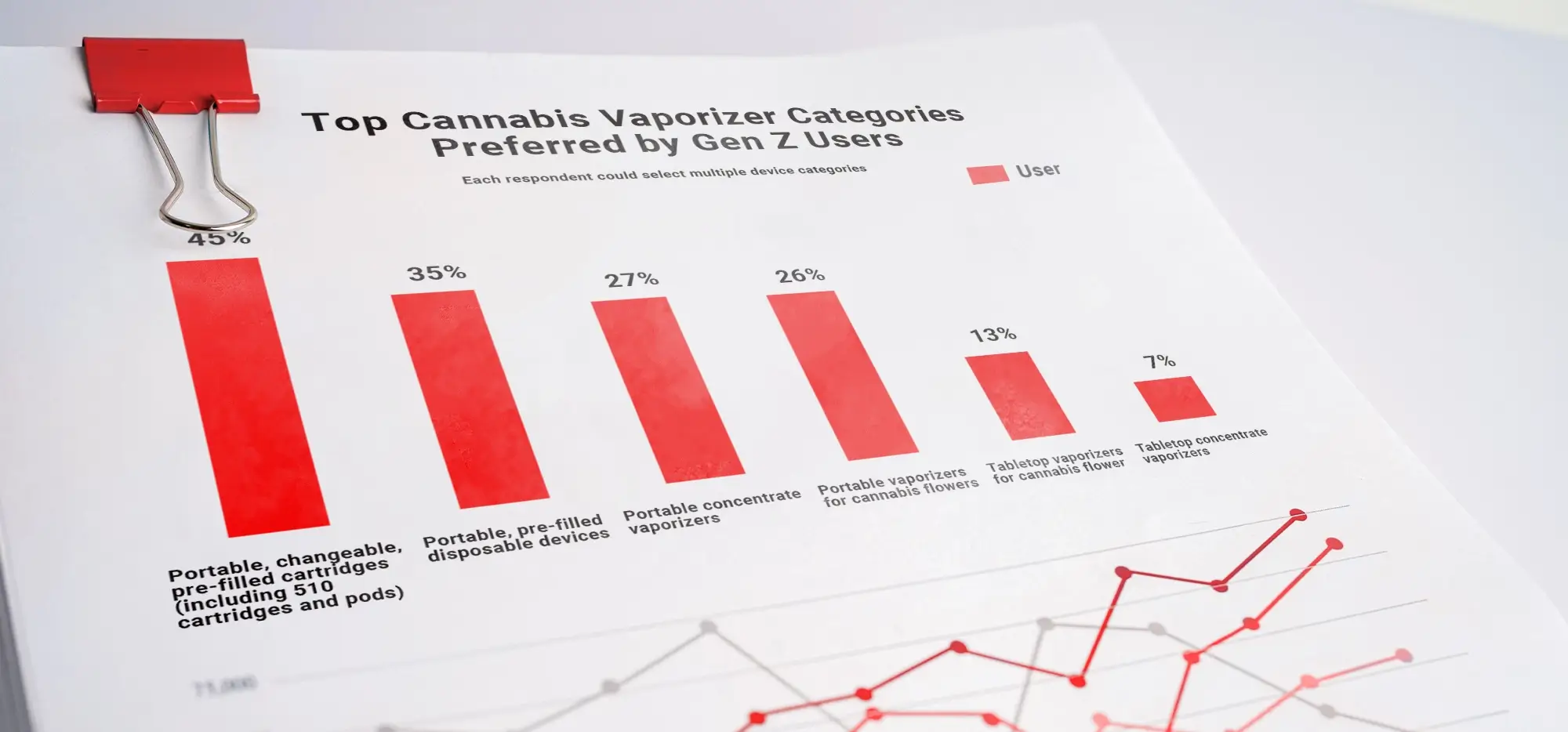
-1.webp)
-1.webp)
-2.webp)


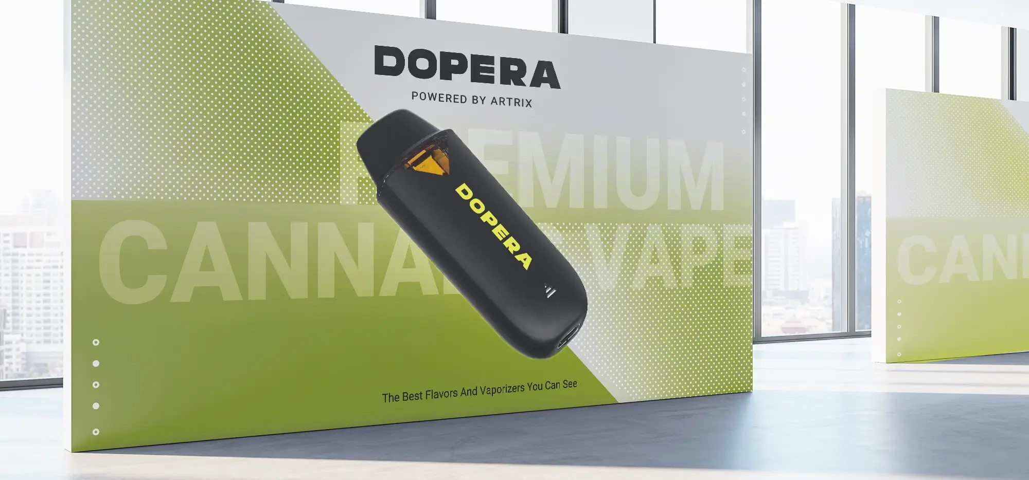


Pod Vape Design Trends: From Discreet JUUL-Style Devices to Smart Cannabis Pods
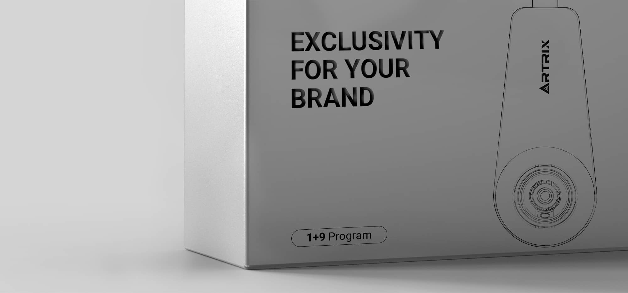
The pod vape has changed the way consumers think about vaporizer devices. Early pod systems made vaping smaller, simpler, and more discreet. Disposable vape brands then pushed device design toward color, visibility, and self-expression. Now cannabis pod systems are moving into a new stage, where smart interaction and adult-market design are becoming more important.
For cannabis brands, this design evolution is more than a visual trend. The look and feel of a pod vape can influence first purchase, repeat purchase, retail recognition, and product trust. A strong device design should make the product easy to understand, appropriate for an adult market, and suitable for the oil inside the pod.
| Design Phase | Representative Model | Main Design Feature | Cannabis Pod Vape Application |
|---|---|---|---|
| Discreet minimalism | JUUL-style pod systems | Small, simple, low-friction devices drive adoption | Keep pod vape setup easy and intuitive |
| Visible self-expression | Elf Bar-style disposables | Color and identity can increase retail recognition | Use adult-oriented visual identity without youth-coded cues |
| Cannabis-specific performance | Live resin, rosin, specialty oils | Oil type changes hardware needs | Match heat, airflow, and battery behavior to extract strategy |
| Light smart interaction | Xlite-style smart pod | Useful intelligence should not add friction | Add voltage, preheat, and visual feedback without app complexity |
Why Pod Vape Design Matters
In a crowded cannabis vape market, hardware design helps a product communicate quickly. A consumer may compare a disposable vape, a 510 cartridge, and a pod vape in the same retail visit. If the pod system looks confusing, generic, or difficult to use, the customer may choose the simplest option instead.
Good pod vape design answers basic questions before the consumer asks them. How do I use it? Which pod fits? Is it rechargeable? Does it feel reliable? Does it match the kind of oil experience I want? When the device answers these questions visually and functionally, it becomes easier for retailers and budtenders to recommend.
Design also affects loyalty. If the design feels good, looks recognizable, and performs consistently, it can become a daily reminder of the brand. That is why pod vape design is closely connected to repeat purchase.
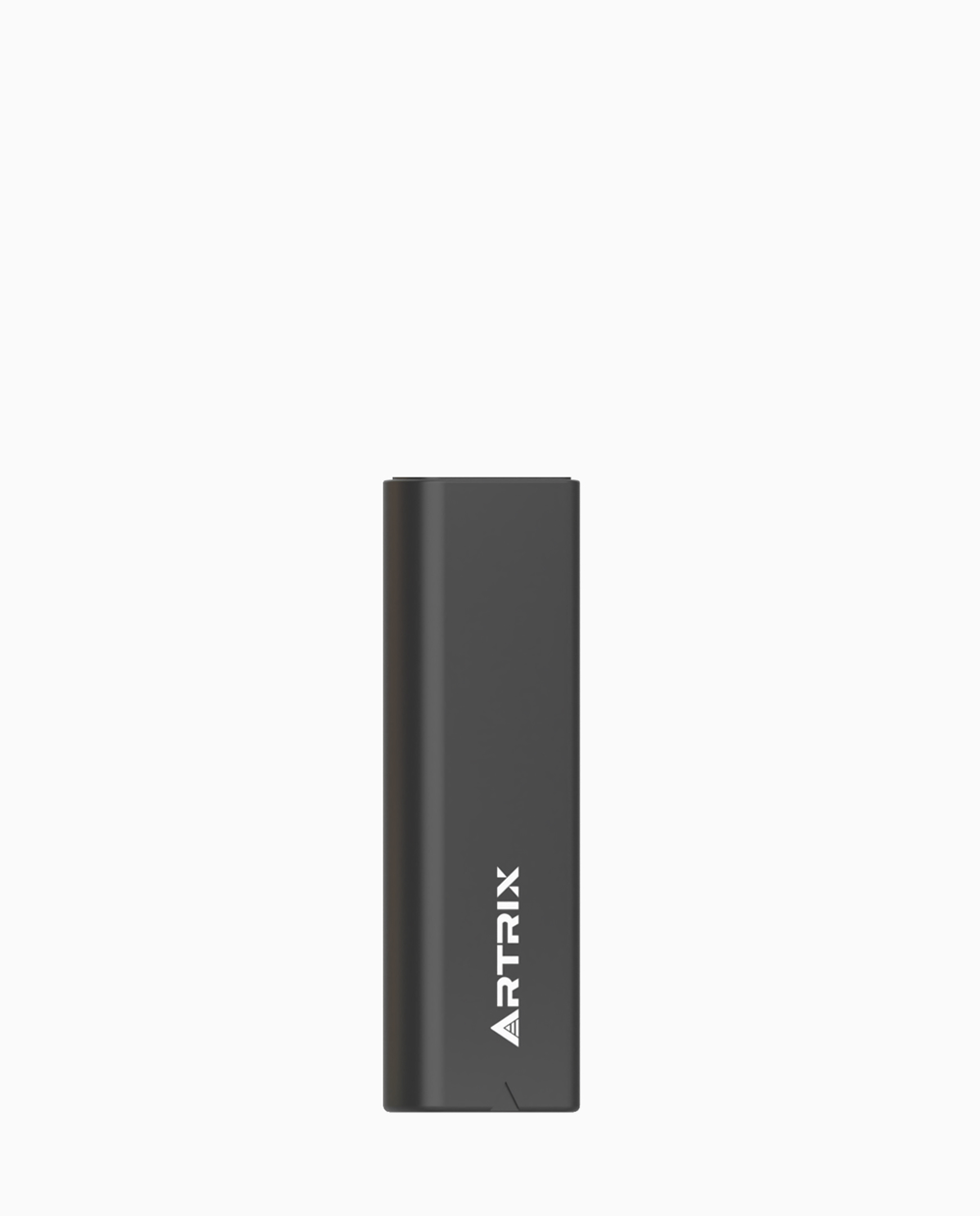
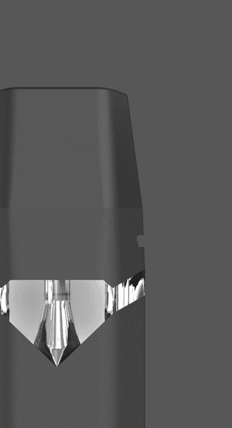
Phase 1: JUUL and Minimalist Pod Design
JUUL helped make compact pod systems familiar to many consumers. Its design language was simple, small, and discreet. The user did not need to understand many settings or parts. The basic idea was easy: charge the device, insert the pod, and use it.
Cannabis pod vape systems learned from this simplicity. A reusable battery plus replaceable pod can reduce confusion compared with a wide range of cartridge batteries and thread types. The battery becomes the stable device, while the pods provide variety over time.
The lesson for cannabis brands is not to copy JUUL’s category or marketing. The lesson is that low-friction design matters. A pod vape should feel easy from the first use. If the consumer needs too much explanation, the product may lose to a disposable vape or familiar cartridge.
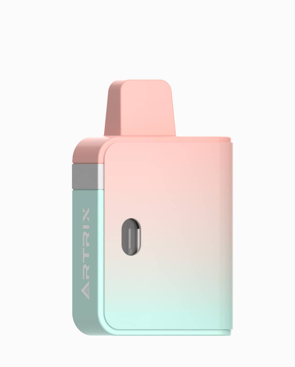
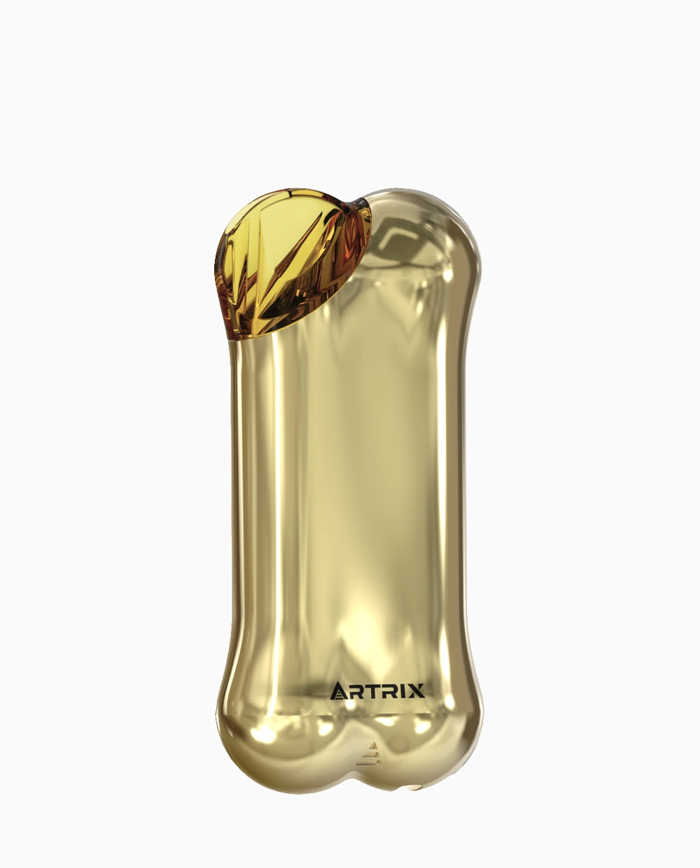
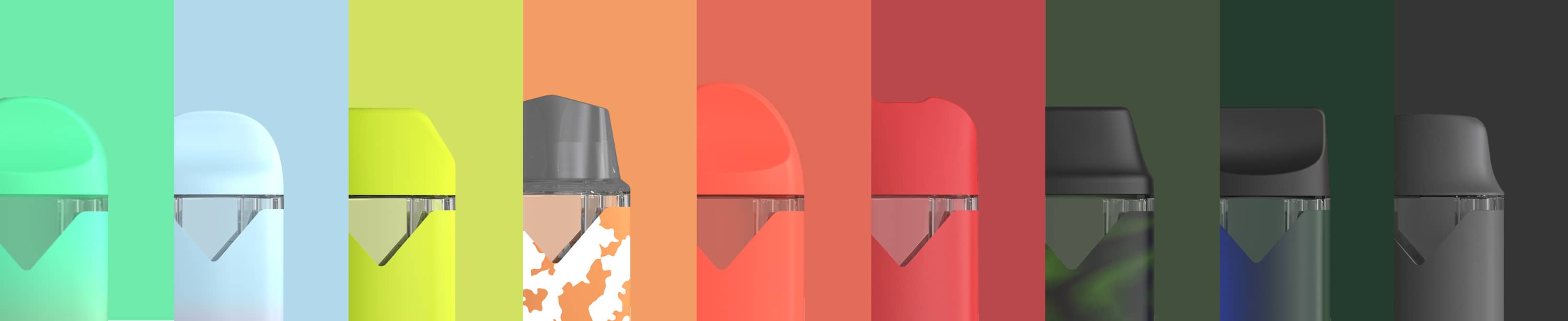
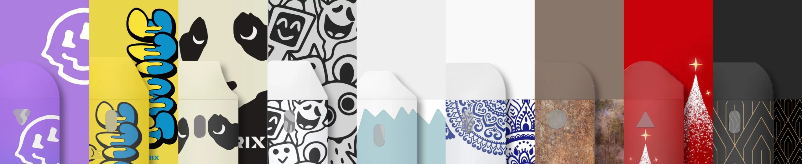
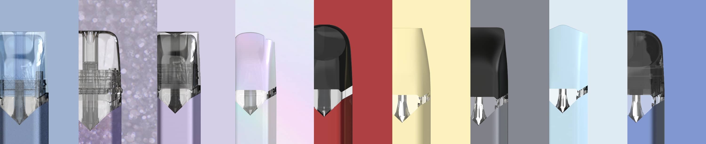
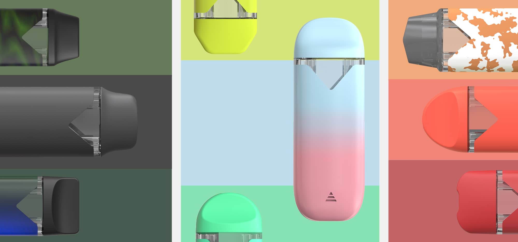
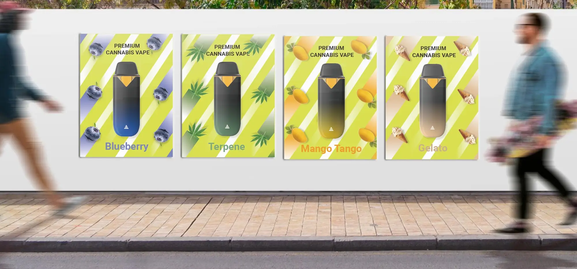
Phase 2: Elf Bar and the Shift from Discreet to Self-Expression
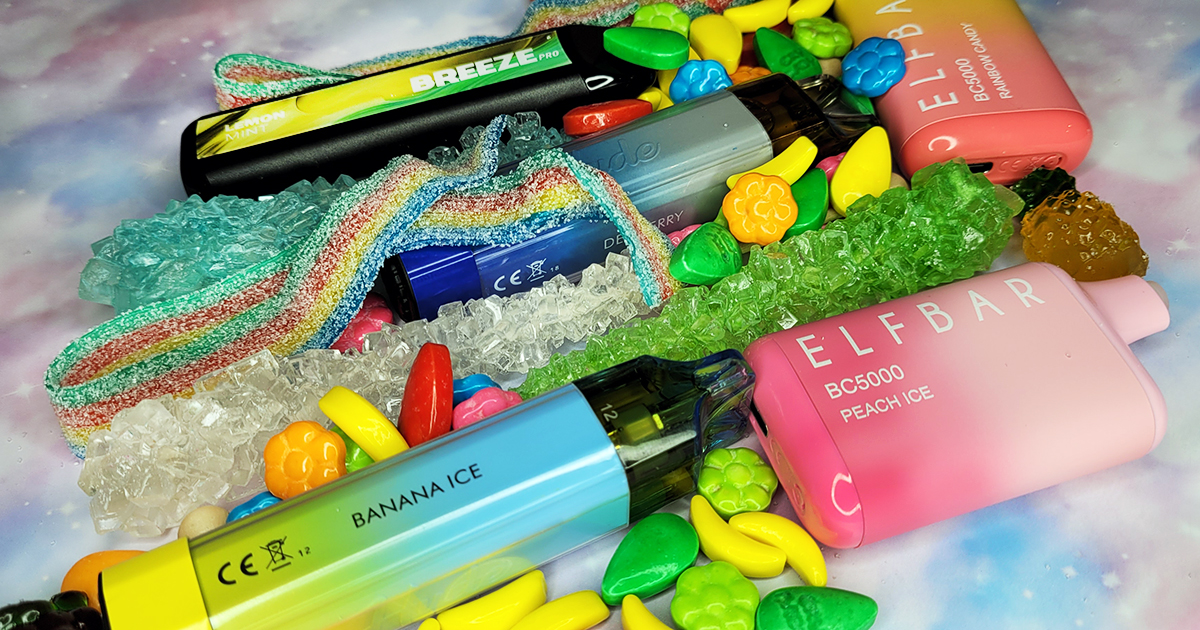
Disposable vape brands such as Elf Bar changed the visual language of vaping. Devices became more colorful, more visible, and more closely connected to flavor identity. This shifted the category from discreet utility toward self-expression and helped turn the device itself into part of the experience.
Cannabis brands can learn from the importance of visual recognition, but they should be careful with execution. Cannabis is an age-restricted category, and device design should be clearly adult-oriented. A product can look modern, stylish, and memorable without using youth-coded colors, cartoon-like cues, or candy-style positioning.
The practical takeaway is balance. A cannabis pod vape should not disappear into generic hardware, but it also should not look irresponsible. Strong materials, clean shapes, transparent functional details, and clear product information can create a premium look without creating unnecessary compliance risk.
These examples should be read as design signals, not templates to copy. Cannabis brands should borrow usability, retail clarity, and visual recognition while avoiding youth-coded visual language.
Phase 3: Cannabis Pods Need More Than Nicotine Vape Design
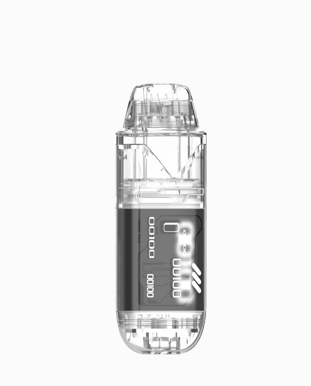
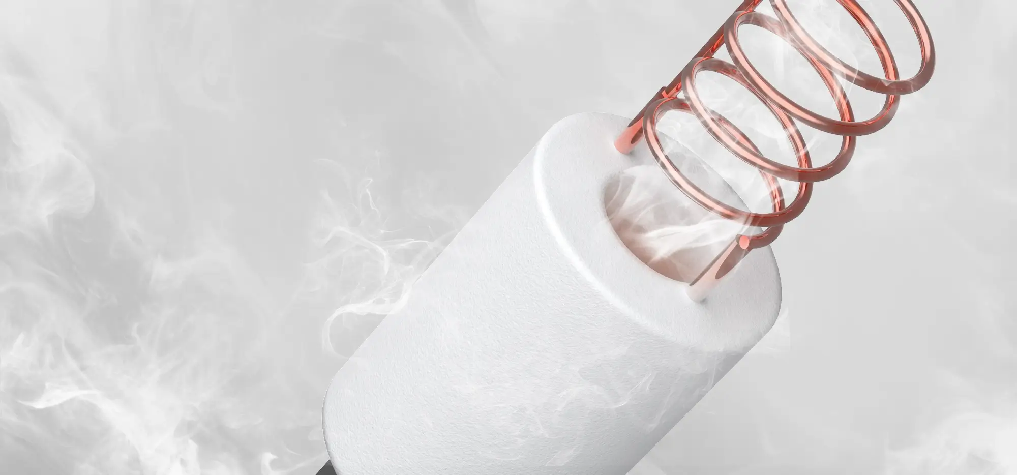
Cannabis pod design has different requirements from nicotine vape design. Cannabis oils can vary in viscosity, terpene content, and extract type. A pod built for a standard distillate oil may not perform the same way with live resin, rosin, or specialty extracts. This means the design must support the oil, not only the hand feel.
Heating behavior is one of the most important factors. Too much heat can damage flavor. Too little heat can create weak vapor or inconsistent sessions. Airflow, pod seal, mouthpiece design, battery output, and preheat behavior all shape the user experience.
This is where cannabis pod vape design becomes a product strategy issue. If a brand sells premium live resin or rosin pods, the device should help protect the flavor story. If a brand sells value-focused distillate pods, the device should emphasize reliability, affordability, and easy use.
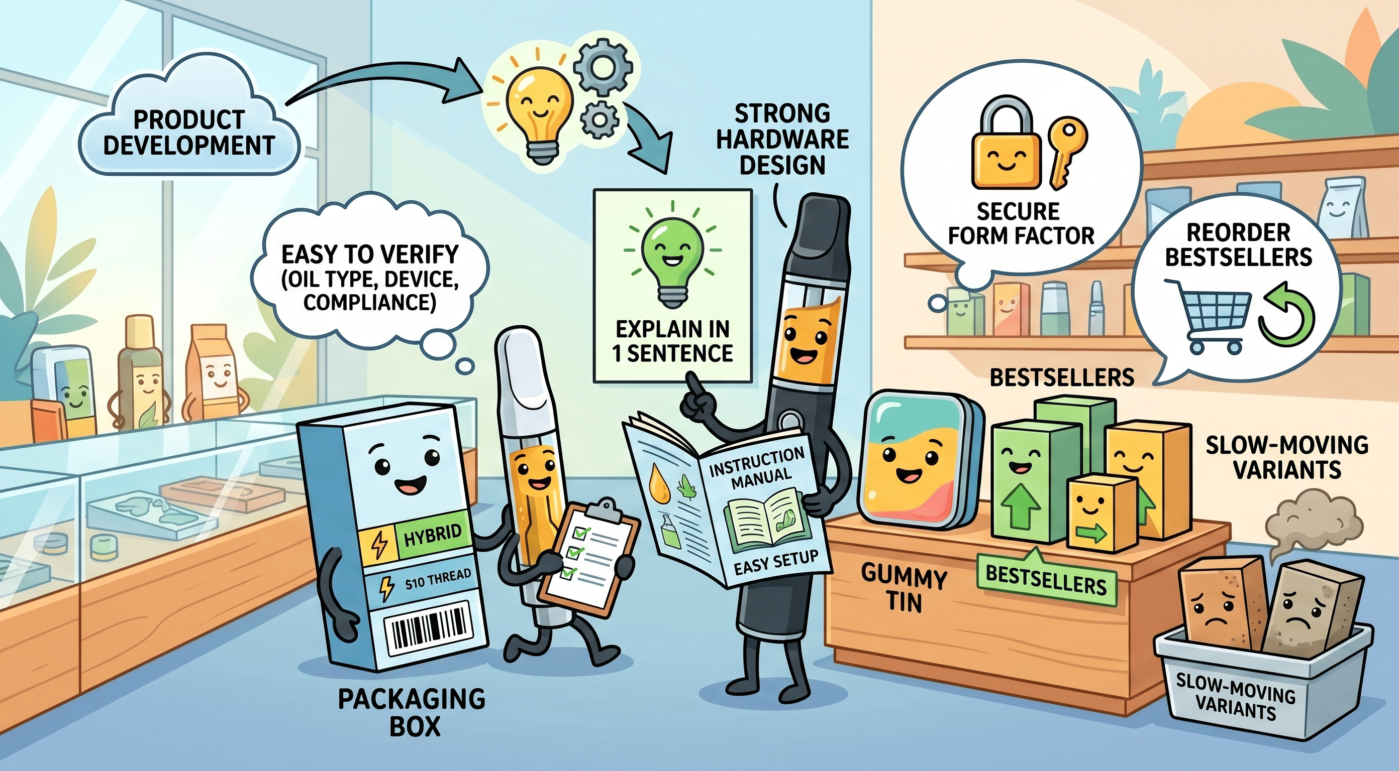
The Retailer Layer: Shelf Space, Assortment, and Sell-Through
One missing layer in many vape-hardware discussions is the retailer. Hardware architecture does not only shape the consumer experience; it also shapes how a product is stocked, displayed, explained, and reordered. A closed pod system asks the retailer to manage a device-and-consumable ecosystem. The starter kit may occupy one shelf position, while pods require additional space by flavor, nicotine strength, or pack size. That structure can support repeat purchases, but it also requires clear merchandising logic so shoppers and staff understand compatibility.
Disposable devices create a different retail challenge. They simplify the shopper decision because there is no separate pod, charger, or refill step, but they can multiply SKU pressure quickly. Each flavor, capacity, battery format, or limited-edition design competes for shelf space. For retailers, the winning disposable is not only the one with the strongest consumer pull; it is the one with clear packaging, reliable sell-through, low return rates, manageable assortment complexity, and fewer compliance headaches.
Cannabis vape hardware adds another layer because retailers often need to explain oil type, potency, hardware format, voltage behavior, device size, and use case within a regulated environment. A live resin cartridge, a rosin disposable, a high-capacity AIO, and a screen-enabled device may all serve different shoppers, but they also create different merchandising and education burdens. If packaging does not clearly communicate formulation fit, device function, and adult-use positioning, the retailer must absorb that burden at the counter.
For cannabis brands, this means product development should include retail usability from the beginning. Strong hardware design should help retailers answer practical questions: How many SKUs are needed to tell the product story? Can staff explain the device in one sentence? Does the packaging make oil type, device type, and compliance information easy to verify? Does the product fit existing display cases? Is the form factor secure enough for high-value inventory? Can the retailer reorder bestsellers without carrying unnecessary slow-moving variants?
This retail layer is where Juul and Elf Bar offer opposite lessons. Juul built a repeat-purchase ecosystem that could create recurring pod sales, but it also required compatibility management and regulatory scrutiny around flavors and youth access. Elf Bar made the purchase simpler, but its disposable model increased shelf competition, SKU churn, and enforcement risk. Cannabis brands that want durable retail placement need to design for both the end user and the retailer who controls visibility, recommendation, and repeat availability.
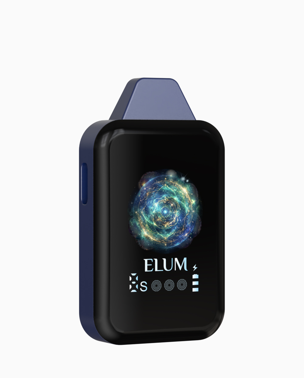
Smart Pod Vape Design Is Growing
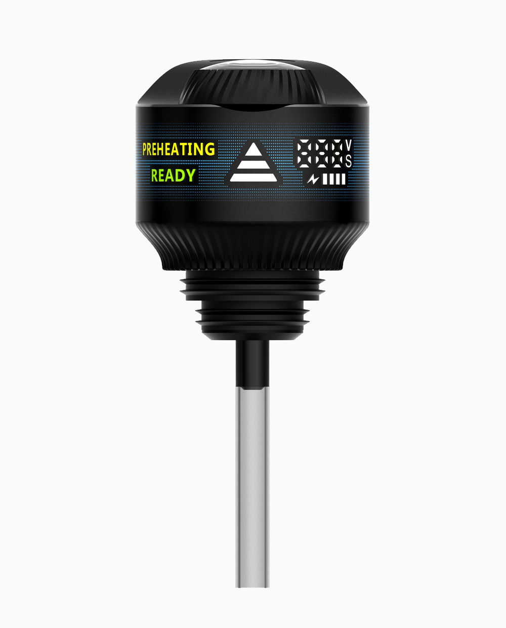
As cannabis pod systems mature, more brands are exploring smart and semi-smart device features. These may include voltage adjustment, preheat, visual indicators, haptic feedback, dose reminders, or app-based controls. The purpose of smart design should be simple: help the user get a better and clearer experience.
However, more features do not always mean better design. Some users want advanced control, while others want a device that works immediately without setup. If smart features make the product harder to use, they can weaken the main advantage of a pod vape.
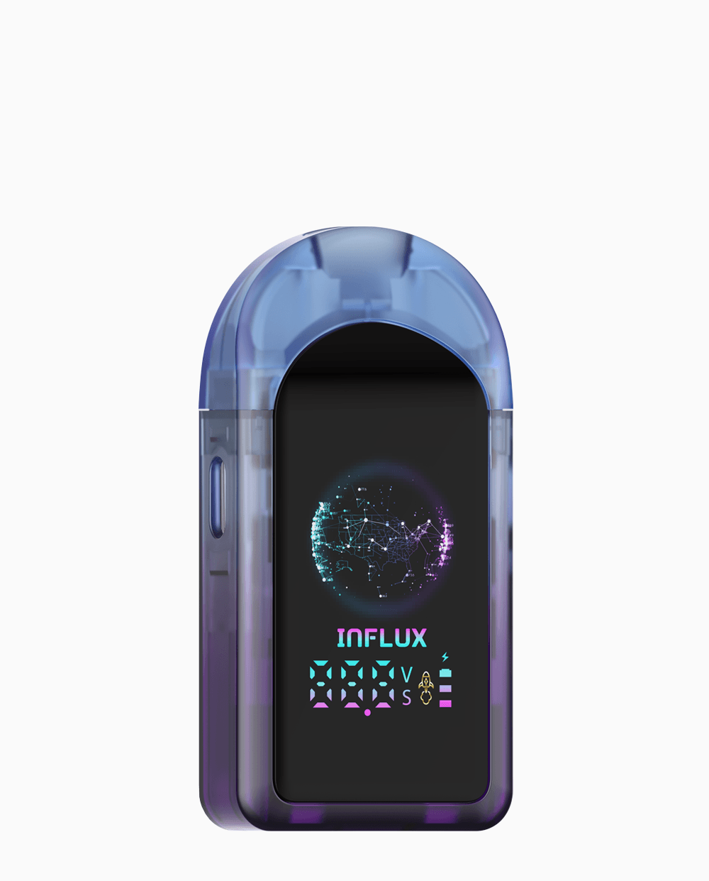
This is why light smart design is becoming attractive. A light smart pod gives users helpful control and feedback without requiring a complicated app experience. It can make the device feel modern while keeping the learning curve low.
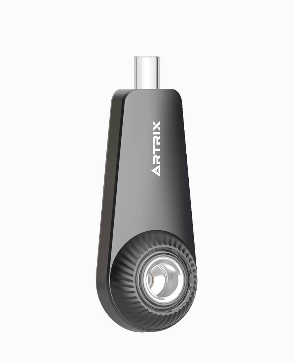
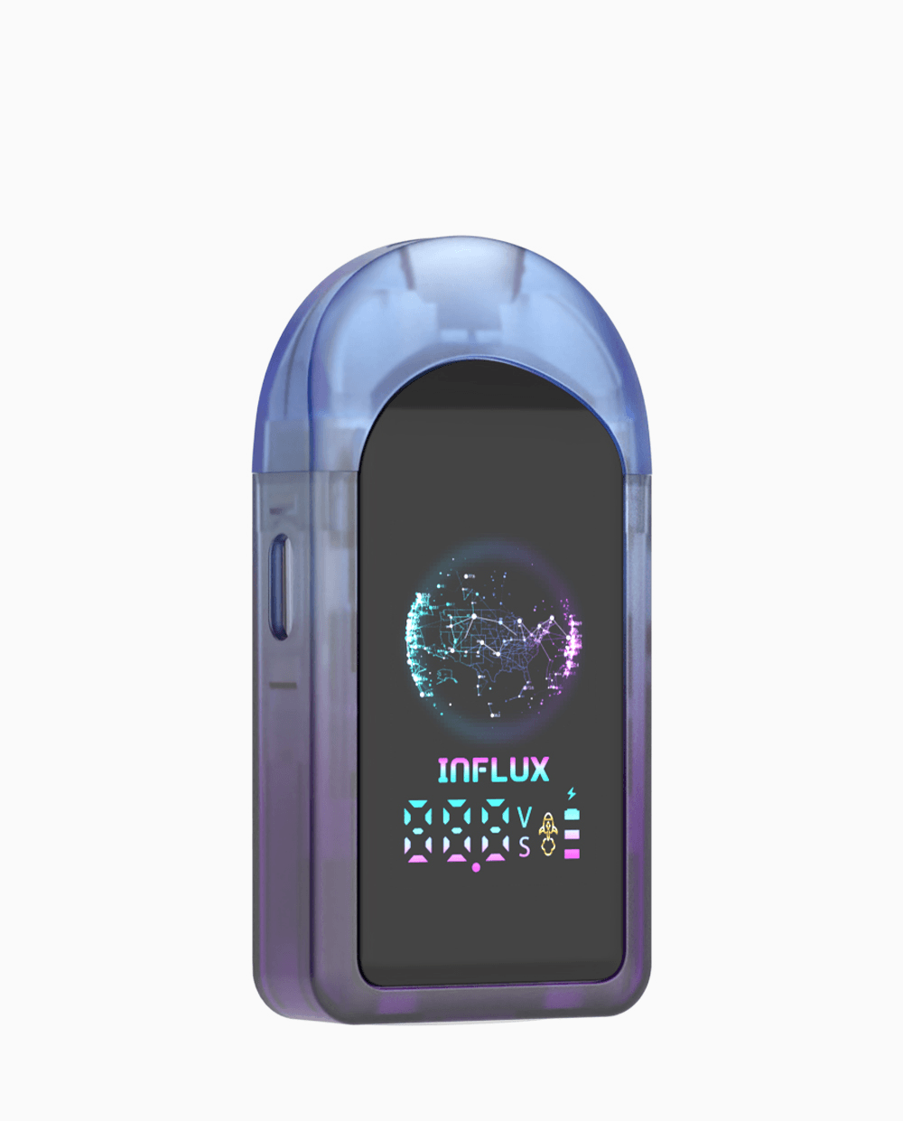
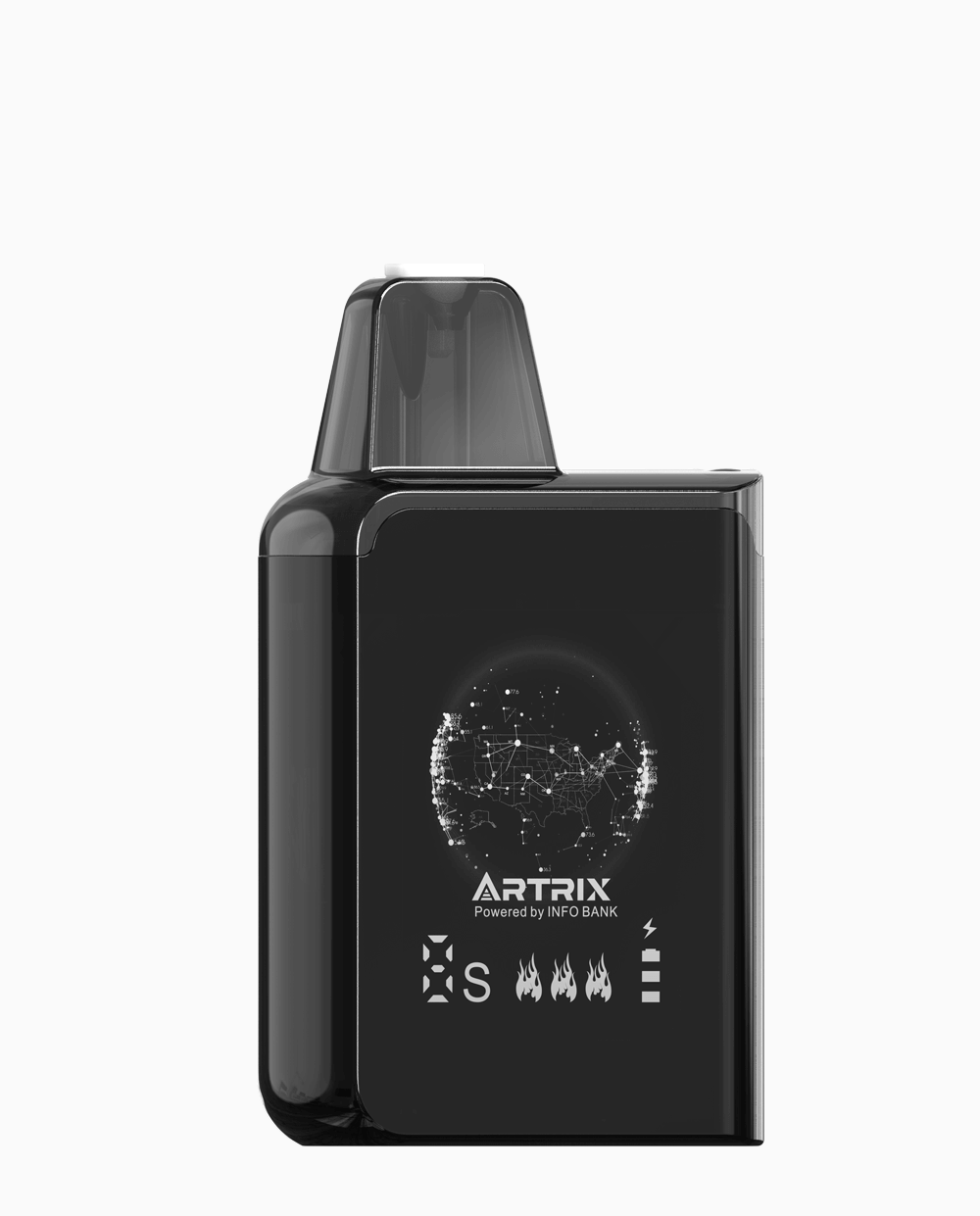
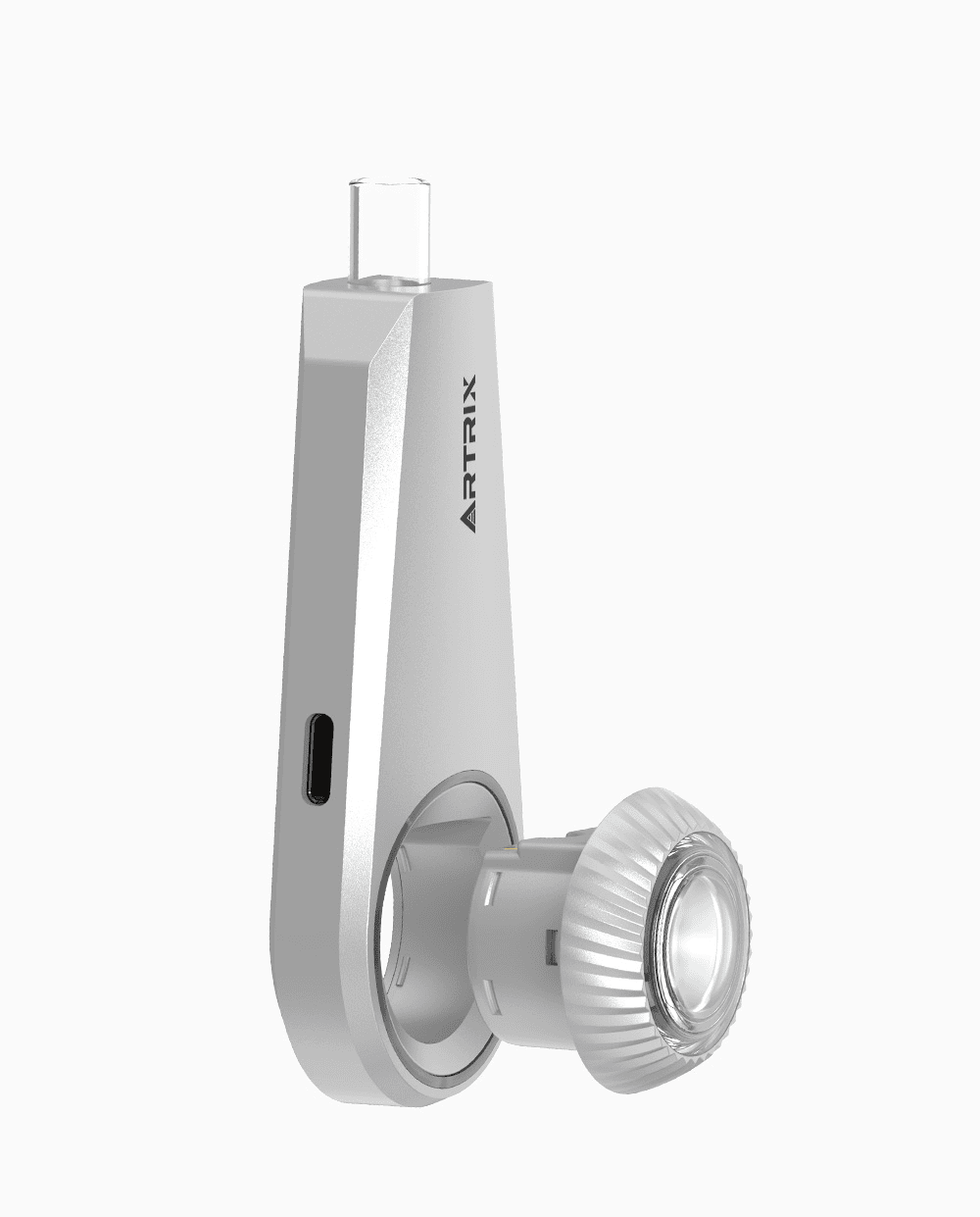
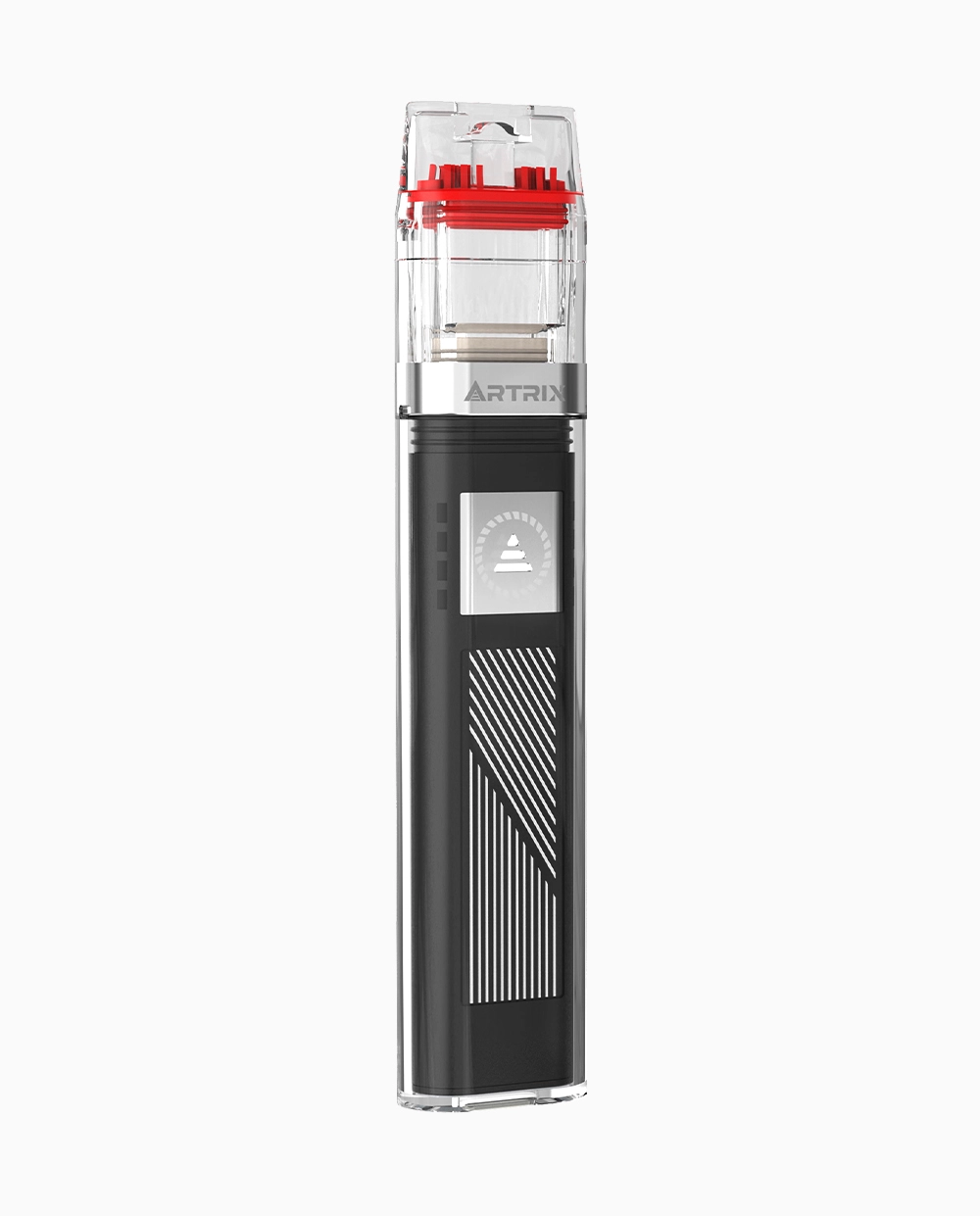
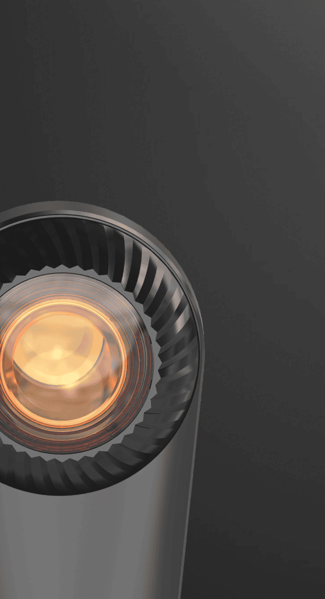
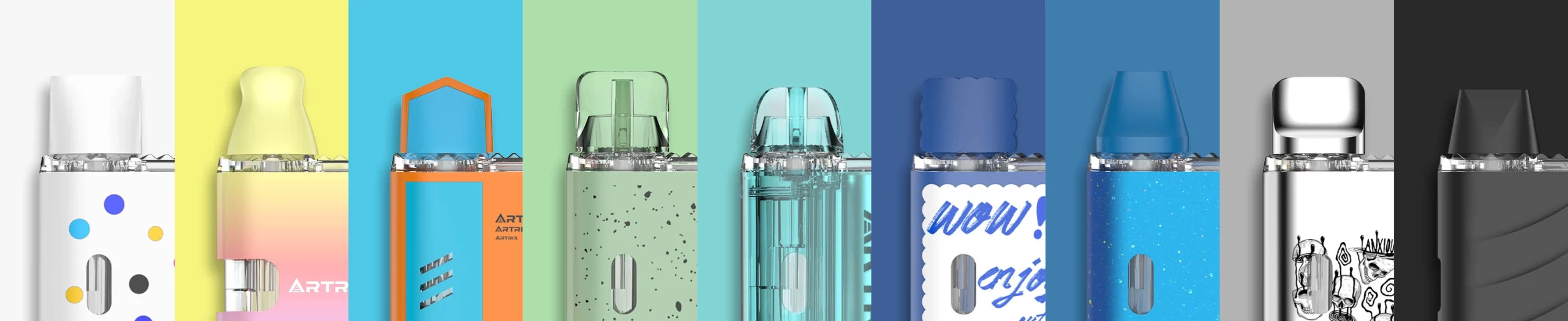
Xlite and the Light Smart Pod Direction
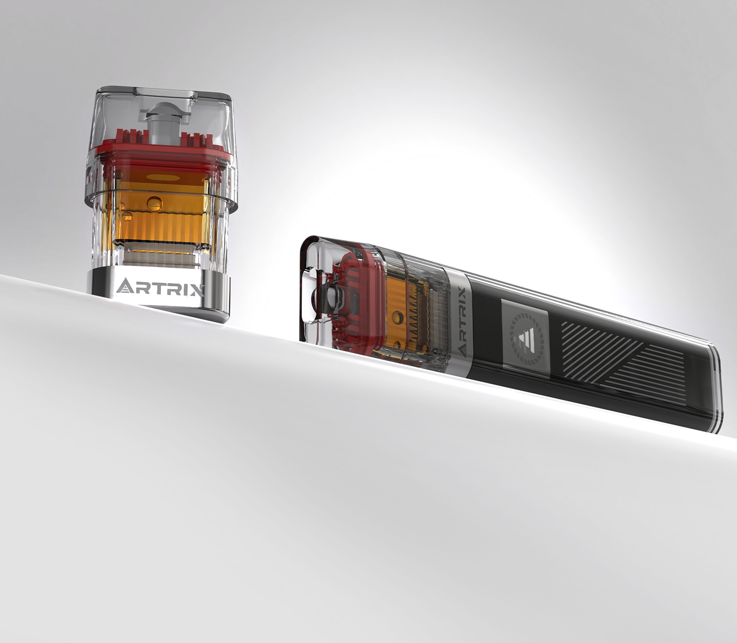
Xlite is a useful example of the light smart pod direction. Instead of making the app the center of the experience, Xlite focuses on direct device interaction, voltage modes, preheating, and visible feedback. This gives brands a way to offer a smarter pod vape without making the product feel technical or intimidating.
For adult consumers who are used to smart watches, earbuds, and touch-based electronics, this kind of interaction can feel natural. They may not want to manage another app, but they may appreciate a device that responds clearly and gives them more control. For retailers, the explanation is also simple: it is a smarter pod experience without heavy setup.
For cannabis brands, Xlite-style design can create differentiation in a market where many batteries look similar. It helps connect product function with visual identity, which can be especially useful for brands targeting younger adult consumers or premium pod lines.
| Xlite Design Feature | Design Problem It Solves |
|---|---|
| Voltage modes | Different oils and users may need different intensity levels |
| Preheating | Thicker oils or cold starts may need preparation |
| Visible feedback | Users need to understand device status quickly |
| Direct interaction | Smart control should not require heavy app setup |
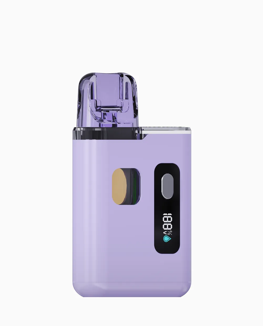
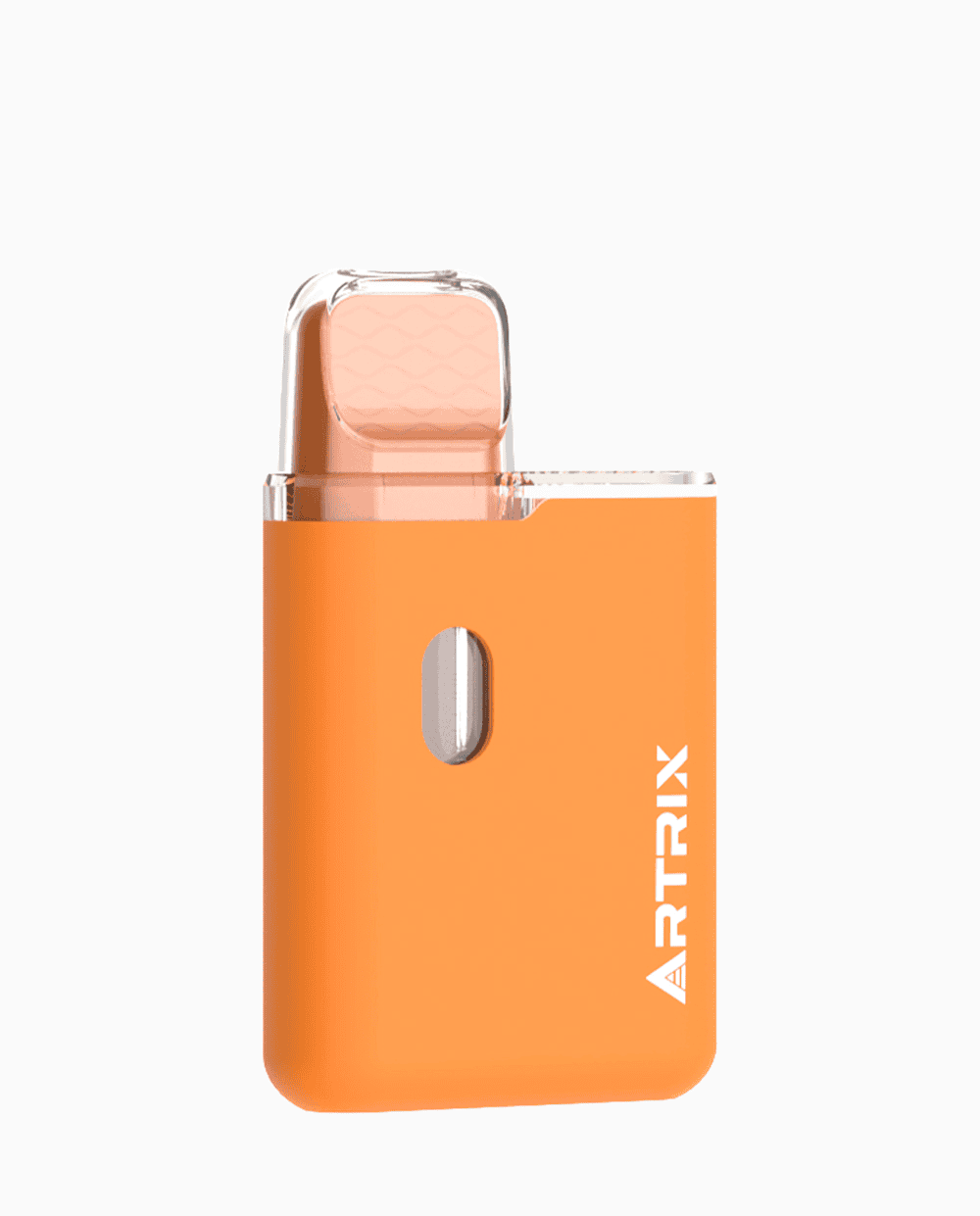
Designing for Adult Gen Z Consumers
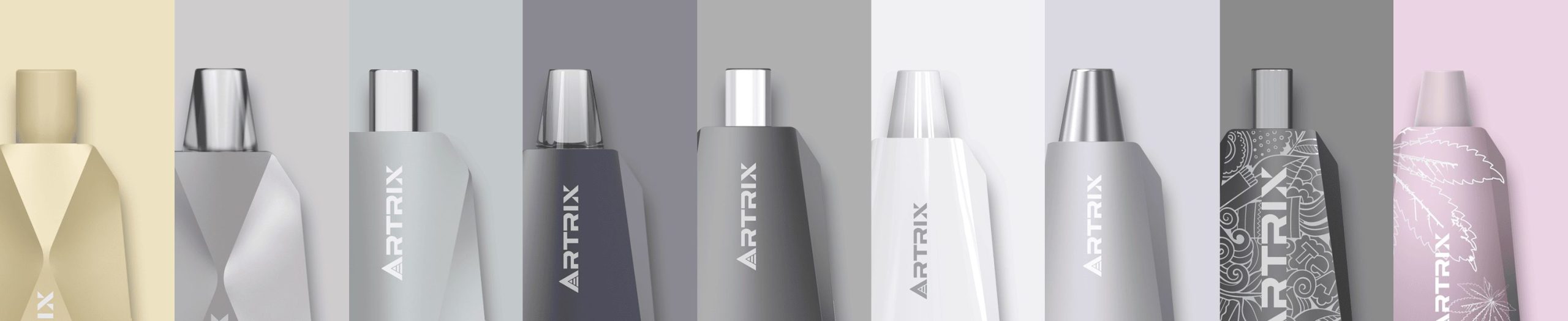
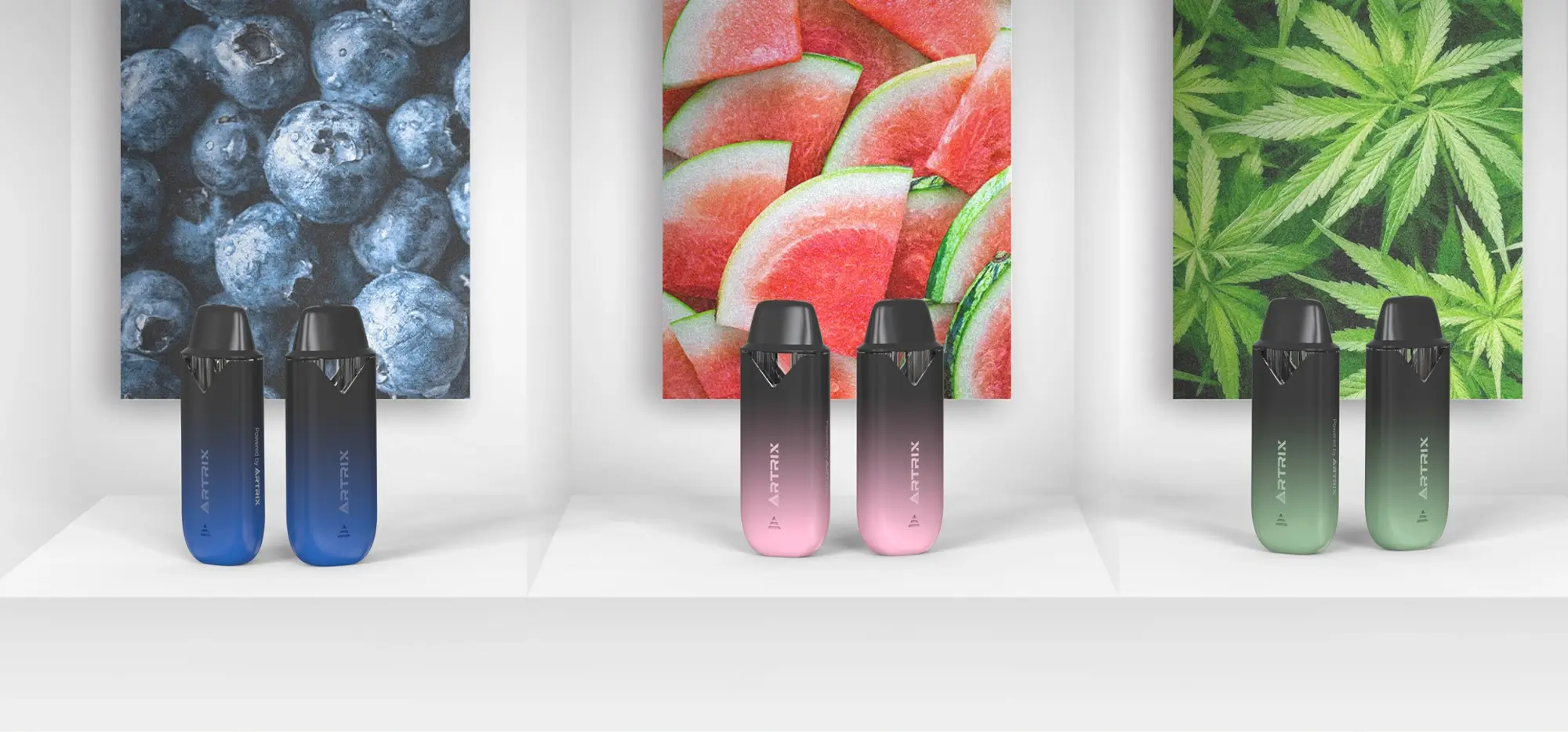
Adult Gen Z consumers often expect products to feel interactive, portable, and visually intentional. They are familiar with small electronics that use lights, touch, magnets, charging cases, and status indicators. A plain battery can still work, but it may not feel distinctive.
At the same time, cannabis brands must avoid youth appeal. The goal is not to make the device look like a toy or candy product. The goal is to create adult design language: clean, confident, easy to understand, and connected to the brand’s product tier.
The goal is adult Gen Z relevance, not youth appeal. Design should feel modern, responsive, and expressive while remaining clearly positioned for licensed adult cannabis markets.
Useful design cues may include transparent materials, precise lighting, compact shape, strong charging design, clear pod visibility, and simple control gestures. Each feature should have a reason. If a design element does not help the user understand or enjoy the product responsibly, it may be decoration rather than value.
Pod Vape Design Checklist for Cannabis Brands
| Design Question | Why It Matters |
|---|---|
| Is the first use obvious? | Simple operation helps reduce retail friction. |
| Does the battery feel worth keeping? | A reusable device supports repeat pod purchases. |
| Does the design match the oil type? | Premium extracts need stronger performance support. |
| Is the visual style adult-oriented? | Responsible design helps reduce compliance and brand risk. |
| Can budtenders explain it quickly? | Retail clarity improves adoption. |
The Future of Pod Vape Design
The future of pod vape design is not only smaller devices or brighter colors. It is controlled simplicity. Consumers still want convenience, but brands also need differentiation, better extract performance, and stronger product identity. The best devices will add useful intelligence without making the experience feel complicated, moving from discreet hardware to adult self-expression with a clear purpose.
Reusable pod systems have a clear advantage when they are designed well. The battery can become a brand asset. The pods can create repeat purchase. Smart features can support better control. Visual design can help the product stand out in retail without losing adult-market discipline.
Conclusion: Better Pod Vape Design Builds Better Brand Memory
Pod vape design has evolved from discreet minimalism to visible lifestyle hardware and now toward smarter cannabis devices. Each stage offers a lesson. Simplicity drives adoption. Visual identity drives recognition. Smart interaction can drive differentiation when it solves real user problems.
For cannabis brands, the strongest design strategy is not to chase every trend. It is to build a pod vape system that is easy to use, reliable with the chosen oil, responsible for an adult market, and memorable enough to earn repeat purchase. That is where design becomes more than appearance. It becomes part of the brand’s growth strategy.
A complete design strategy should connect battery loyalty, pod-type compatibility, and light smart interaction into one adult-market pod system.